Advertisement
Data science is full of questions—lots of them. But finding the answers means more than just pulling numbers from a spreadsheet. You need to see patterns, draw comparisons, and turn raw data into something you can act on. That’s where Tableau comes in. Known for its visual-first approach, Tableau helps data scientists explore, explain, and share findings in a way that's both clear and practical. Let’s talk about what makes Tableau stand out, how it's used in data science, and what value it brings to the table—pun intended.
Tableau isn’t new, and it wasn’t built just for data science. But its features happen to work well with how data scientists work. You're often juggling multiple datasets, testing hypotheses, and working with people who may not speak SQL or Python. In those moments, Tableau acts as a bridge—between raw data and a finished insight, between you and whoever needs to understand the outcome.
Tableau’s drag-and-drop interface does most of the heavy lifting. You can filter, group, sort, and visualize data without writing code. That doesn’t mean it's limited—just that it's approachable. Whether you're running regressions or analyzing trends across time, the interface guides your thinking visually, which is helpful when you're still in the discovery phase.
For data scientists who work with live data—think financial dashboards or web analytics—Tableau connects directly to data sources like SQL, Google BigQuery, and cloud platforms. This way, your dashboards aren’t static. They refresh as the underlying data changes, which makes your work more relevant, especially when decisions rely on up-to-date metrics.
While Tableau doesn’t replace code-based tools like Python or R, it plays a supporting role in multiple stages of a typical data science pipeline.
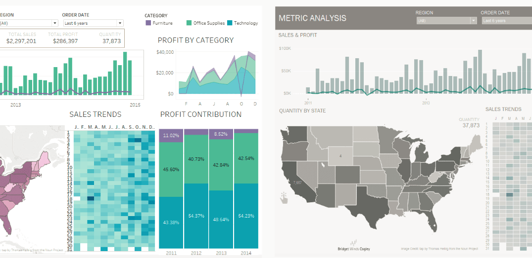
Before building models or running tests, you first need to understand what you’re working with. Tableau helps here by turning big, messy tables into interactive visuals. With a few clicks, you can spot outliers, compare variables, or check distribution shapes. For example, if you're analyzing housing data, Tableau lets you quickly check how prices shift across neighborhoods or how square footage lines up with cost—without touching a single line of code.
When deciding which variables matter, Tableau can help surface relationships you might otherwise miss. Let’s say you're building a churn prediction model. By visualizing customer age, usage patterns, and payment history, you can see which metrics show noticeable differences between loyal and at-risk users. These visual clues help narrow down which features deserve a place in your model.
Once the model is built and deployed, someone has to track how it’s performing. Tableau is handy for creating monitoring dashboards where key metrics—like accuracy, recall, or revenue impact—update automatically. This is especially useful when working in teams, where stakeholders want results but don’t have the time (or interest) to dig through Jupyter notebooks.
The appeal of Tableau isn't just that it creates good-looking charts. It’s about how those charts fit into your day-to-day work and how they affect what others take away from your findings.
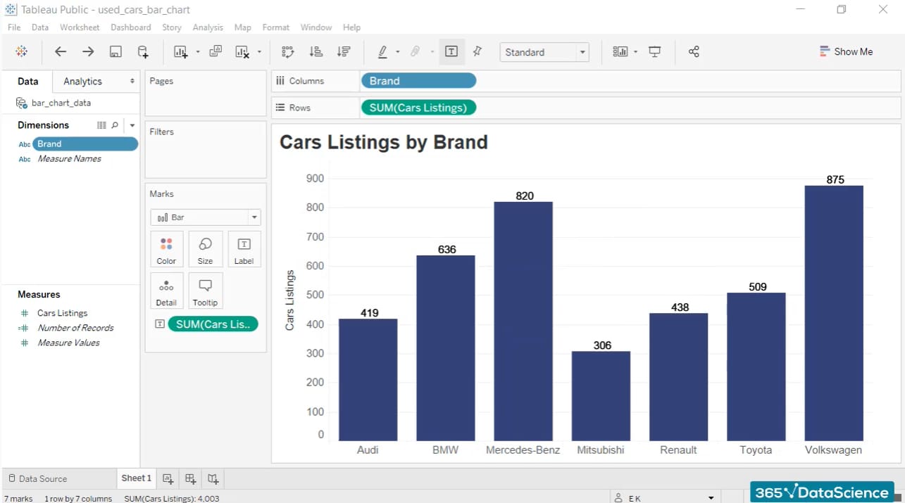
Tableau makes it simple to share work through dashboards or Tableau Server. Instead of explaining results through slides or lengthy docs, you can let the data speak for itself—literally. Anyone can hover over charts, filter by category, or drill into details without risking the integrity of the original dataset.
It’s one thing to have the right numbers. It’s another thing to have them seen and understood. A clean Tableau dashboard helps decision-makers focus on what matters—whether that’s a red flag in user behavior, a shift in seasonal trends, or a gap in market coverage. The better the understanding, the more informed the action.
While Tableau is a visual tool, it doesn’t live in isolation. You can export preprocessed data from Python or R into Tableau. Some users even go the other way—using Tableau to define filters or cuts of the data and then feeding those into code-based pipelines. The point is: you don’t have to choose. You can mix and match based on what’s easiest or most efficient.
Let’s say you’re starting a data science task and want to use Tableau. Here’s where it fits in. Whether you're pulling from a CSV, a cloud warehouse, or a SQL server, Tableau connects directly. Once linked, it shows a preview so you can spot missing values, wrong column types, or other issues right away. You can clean in Tableau or outside it, but keep only what you need. Tableau lets you create calculated fields or filters without switching windows. Want to make a date bucket or flag rows with missing values? You can do it right there.
This is where Tableau stands out. Try bar, scatter, line, or box plots, depending on the relationship you're testing. Use filters to isolate groups and color to highlight changes. This part is about finding the story in the data, not building the final dashboard. Once you know what matters, turn it into a dashboard. Think of it as a control panel for your analysis. Add filters, dropdowns, and tooltips to make it interactive. If someone looks at it and gets the insight in ten seconds, it’s working.
You can share it through Tableau Public or Tableau Server or export it as an image or PDF. The goal isn't just to deliver—it's to get feedback. Someone might notice a pattern you missed or find a chart unclear. Tableau makes it easy to adjust without redoing everything.
Tableau doesn’t try to replace the core tools of a data scientist—it complements them. It brings clarity to complex datasets, encourages exploration, and helps others see what you see. In a field where understanding can make or break decisions, that kind of clarity is hard to overstate. Whether you're deep in modeling or presenting results to a client, Tableau gives you a cleaner way to say, “Here’s what the data says—and here’s why it matters.”
Advertisement

Wondering who should be in charge of AI safety? From governments to tech companies, explore the debate on AI regulation and what a balanced approach could look like

Explore how Natural Language Processing transforms industries by streamlining operations, improving accessibility, and enhancing user experiences.

Multimodal artificial intelligence is transforming technology and allowing smarter machines to process sound, images, and text

Not sure how Natural Language Processing and Machine Learning differ? Learn what each one does, how they work together, and why it matters when building or using AI tools.

Looking for an AI that delivers fast results? Claude 3 Haiku is designed to provide high-speed, low-latency responses while handling long inputs and even visual data. Learn how it works

Ever wonder why your chatbot avoids certain answers? Learn what AI chatbot censorship is, how it shapes responses, and what it means for the way we access information
How can Tableau enhance your data science workflow in 2025? Discover how Tableau's visual-first approach, real-time analysis, and seamless integration with coding tools benefit data scientists

Struggling with code reviews and documentation gaps? Discover how SASVA from Persistent Systems enhances software development workflows, offering AI-powered suggestions

Can smaller AI models really compete with the giants? Discover how Small Language Models deliver speed, privacy, and lower costs—without the usual complexity

Thinking of running an AI model on your own machine? Here are 9 pros and cons of using a local LLM, from privacy benefits to performance trade-offs and setup challenges
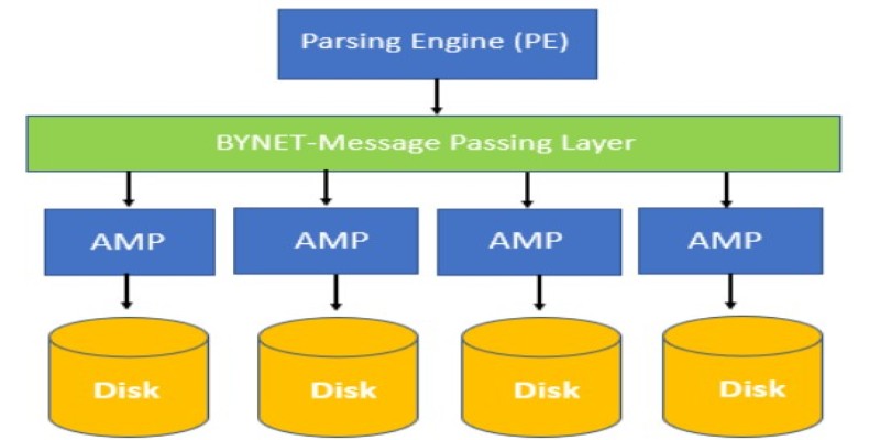
Find out the concepts of Teradata, including its architecture, key features, and real-world uses. Learn why Teradata remains a reliable choice for large-scale data management and analytics

What AI tools are making a real impact in 2025? Discover 10 AI products that simplify tasks, improve productivity, and change the way you work and create